How to Design Your Home with Color Psychology in Mind
Color psychology – how does it relate to interior design?
Well, have you ever wondered why certain color schemes in a space make you feel a certain way? It turns out that there’s a science behind it.
Color psychology in interior design is the study of how different hues affect our moods and behaviors within a space. And while there are tons of different theories out there, understanding the basics can help you improve your interior design skills.
Below are a few things to keep in mind as you start using color psychology in your design process.
Color Psychology in Interior Design
Color has the power to evoke certain feelings and emotions, so it’s important to understand how colors interact with each other to create the atmosphere you desire. For this reason, color psychology can help guide your decisions about wall colors, furniture fabrics, accessories, and more.
An excellent way to select paint colors for an interior when you don’t know where to start is by using color psychology. It can also help you create a look for a space that reflects the way you or your client want to feel.
How Does it Work?
For instance, consider this:
You have a client that wants to make over their master bathroom. This bathroom is spacious enough to accommodate a shower and a footed tub. Your client knows that they want their bathroom to feel relaxing; this is a space for them to unwind after a long day. However, they don’t have any particular room colors in mind.
You can successfully convey a relaxing environment by utilizing color psychology. Color psychology in interior design tells us that color schemes with green or blue would be best.
You would then proceed to make one (let’s say a light green) your primary color. You could then pair your main color with natural tones such as cream, tan or brown. These colors are also found in nature, and would thus bring touches of nature indoors to the space. This would in turn strengthen the calming effect that your client is looking for.
Conversely, a bright red would be a terrible choice according to color psychology. The human brain would be overstimulated, the exact opposite of what you are trying to achieve.
Color Psychology and Color Theory
Color Saturation: Different Shades and Tints
Before we dive into the common associations we have with colors, it is pertinent to establish the importance of color saturation.
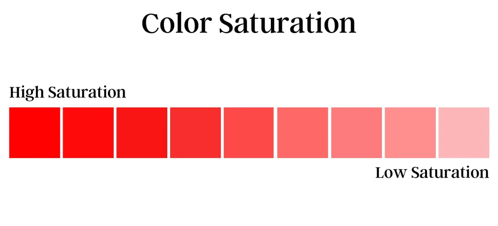
In color theory, color saturation is how ‘pure’ a color appears. The purest colors are the primary colors. These primary colors – red, blue and yellow – are highly saturated when they appear bright and bold. When they are a light shade or pale, then they have low saturation.
The saturation of a hue will affect how we interpret it. Generally speaking, we associate red with passion, while pink (a tint of red) is more tranquil.
Therefore, any color with high saturation (vibrant shades) will evoke strong emotions. Variations of a hue with low saturation we perceive as toned-down, both literally and psychologically.
Warm vs Cool Toned Colors
When you look at the color wheel, you can see how warm colors are similar to one another. Yellow is similar to orange, which is similar to red. This is because these colors are analogous, meaning they appear next to one another on the color wheel.
We associate warm-toned colors with happiness, warmth, and invigorating energy.
We perceive cool colors such as blue, green, and purple as calming colors. They don’t carry the invigorating energy of warm colors, but they are just as useful for spaces like libraries, home offices, or bathrooms.
Tertiary colors like yellow-green that mix cool and warm colors bring balance to a space that you’d like to be energizing but refined.
If you’d like to learn more about color theory, you can check out that blog post here.

Red Color Psychology in Interior Design
We – and some animals too – are naturally drawn to the color red.
Red with high saturation is associated with passion and excitement. It’s commonly used for branding and marketing because out of all the colors, it captures our attention most.
However, it is also associated with danger and threats.
For example, studies have shown that the color red produces physiological responses of increased heart rate and blood pressure.
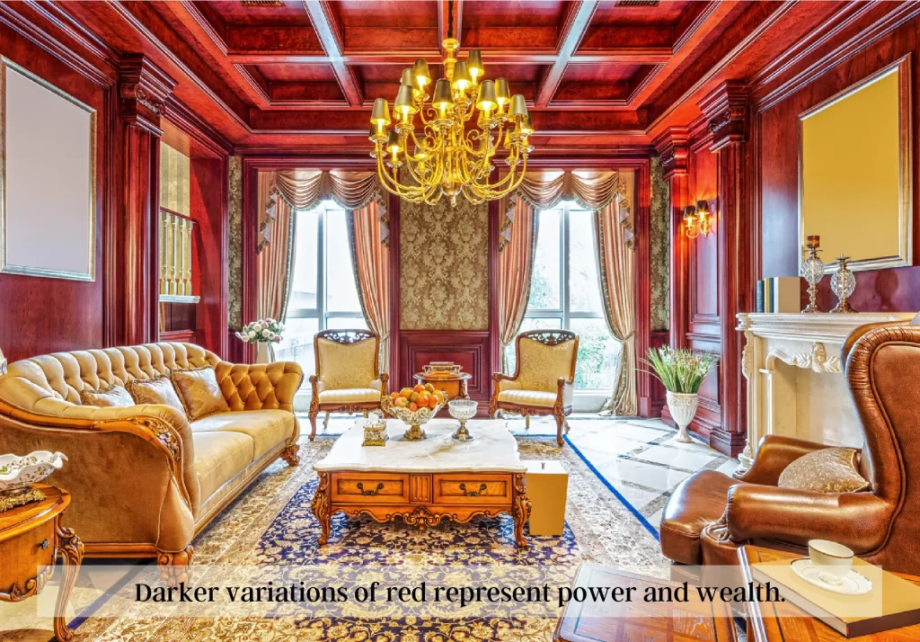
This does not mean, however, that as an interior designer, you cannot use it. You can utilize shades of red like maroon on entire walls. This is because we perceive dark red as a representation of power and wealth.
If you’d like to use red in a color scheme, you can introduce a saturated variation through accent pieces like furniture or drapery.
Yellow Color Psychology in Interior Design
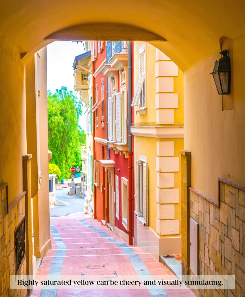
A bright yellow often incites feelings of happiness and optimism.
In part, yellow’s association with happiness is due to its inherent brightness, as yellow naturally conveys a sense of energy and movement. It would consequentially work well within creative spaces like art rooms.
We associated darker shades of yellow such as gold with opulence.
Lighter tints of the color yellow represent intelligence, freshness, and clarity.
On the flip side though, yellow can also be a cautionary color.
Blue Color Psychology in Interior Design
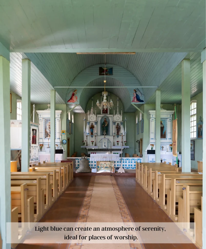
Blue tones have many meanings depending on their saturation.
Vibrant blue induces feelings of loyalty and integrity.
Deeper hues such as navy blue carry convey feelings of peace and safety.
Powder blue works well to create an environment of serenity and calmness.
However, an excess of the color blue may convey a sense of sadness or depression if used incorrectly in its hue or intensity.
Home offices with a color scheme of various shades of blue would be appropriate according to interior design psychology. You could use a dark shade like royal blue as an accent color and utilize lighter shades as the primary color of the space.
Green Color Psychology in Interior Design
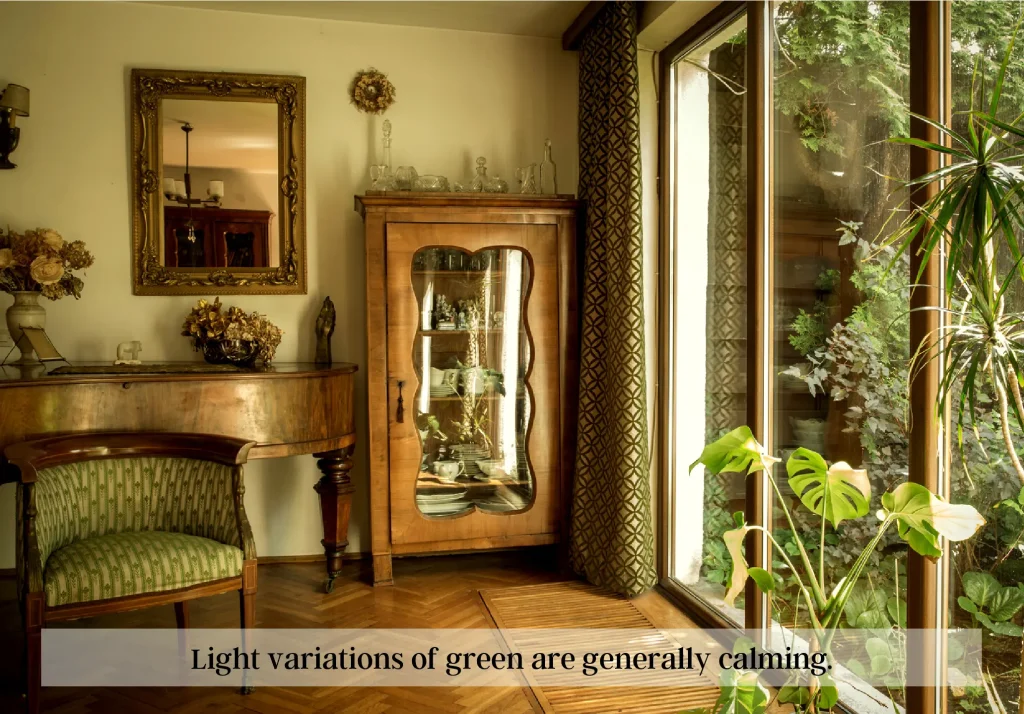
Green is one of the most prominent colors in the natural world, and it’s no surprise that we associated it with growth and calmness.
Interior designers often use light green as a color to make rooms feel airier, as it instantly conjures a calming effect.
Dark green paint colors, such as olive green, can also be soothing as it reflects a sense of security, but will not feel airy. In interior design, dark green carries more visual weight than its lighter counterparts and will thus appear “heavier.”
While there are many positive connotations with the color green, unfortunately, some perceptions can be negative – mainly envy or greed.
Orange Color Psychology in Interior Design

The color orange is friendly. Like most warm colors, it has associations with excitement and celebration.
Light orange can make us feel euphoric. It’s an uplifting color that often invokes positive emotions.
Dark orange on the other hand is more grounded. It often represents wealth, success, and fame.
However, orange also carries hints of danger or alarm in certain cultures – especially when encountered across large surfaces such as walls or carpets. Be mindful of this if you are considering it as a color in your color palette.
Purple Color Psychology in Interior Design
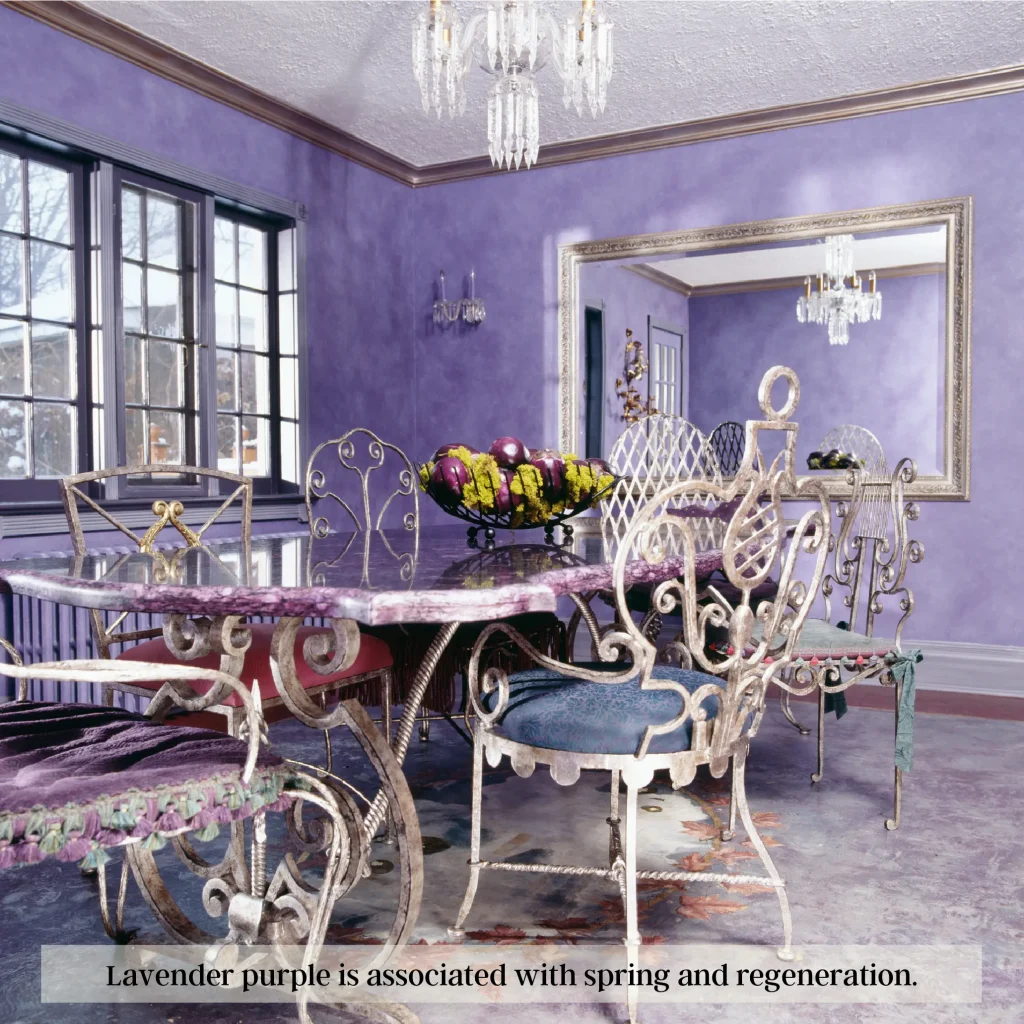
Interiors designed with the color purple often give off a vibe of royalty and dignity, making it a popular choice for formal spaces such as dining rooms.
On the other hand, light purple or pastel purple carries more subdued associations of regeneration. For example, we often see it in the spring with blooming lavender. This is why we commonly see it in Easter and spring décor.
Dark purple in particular carries with it associations of richness and sobriety.
However, on the negative end of the spectrum, purple can appear overbearing and oppressive depending on its saturation.
Pink Color Psychology in Interior Design

We associate the color pink with cheer and youth especially when it is saturated.
Light pink on the other hand represents softness, innocence, and tenderness. We see it as a feminine color due to its association with romanticism and love.
Interiors designed with the right shades of pink can evoke feelings of comfort and tranquility, making them perfect for bedrooms or nurseries. But too much pink can be overwhelming and overbearing, and thus should be used in moderation.
Pink also carries with it a worrying level of vulnerability, so if attempting to create an environment of strength or power, pink should not be the first choice. Ultimately though, when used correctly, pink can create beautiful interiors that are soothing and inviting.
Brown Color Psychology in Interior Design

We associate brown with dependability, reliability, and security. Interior designers use brown to give off a sense of warmth and comfort, making them perfect for cozy bedrooms rooms or libraries.
People also tend to feel more grounded in homes where the color brown is featured heavily – something that can be very helpful in chaotic lives.
Dark brown also carries with it a hint of luxury and sophistication, making it a great choice for opulent rooms or studies.
However, too much brown can feel boring or overbearing. It is important to remember to use the right amounts of tints and shades when incorporating this color into your design project to avoid these kinds of negative connotations.
White Color Psychology in Interior Design

White is functions much like a blank canvas – thus making it a versatile color. Decorating with white can be a great way to create spaces of openness and clarity, while also lending itself as an excellent background to bolder accent pieces.
People often feel at ease in well-designed white interiors, knowing that the color represents purity and cleanliness. It can also be used functionally, as it can reflect light effectively.
A dressing room would benefit from an all-white color palette. By making it the only color, the light reflected on the walls and mirrors would provide a better shopping experience for a customer.
However, too much white can be clinical or sterile and thus should be used in moderation.
By adding accent colors into the mix, one can achieve a balanced design that will look great and feel comfortable.
Black Color Psychology in Interior Design

Black is a powerful color we often associate with power, strength, and authority. Interiors designed in black can look sleek and modern while providing an air of sophistication when used effectively.
People often feel more confident in spaces that incorporate black – something that can be especially beneficial in corporate settings or workplaces. At the same time, too much black can be gloomy and can severely affect our ability to see.
Consequentially, an interior designer needs to use black sparingly, as it can be overwhelming in large spaces or when there is insufficient natural light. Now, this does not mean you cannot paint a wall black. An interior designer can incorporate black through the use of an accent wall or as an accent color in a color scheme.
With this in mind, black can be a great option for grounding a color scheme that may otherwise feel unrestrained.
Gray Color Psychology in Interior Design
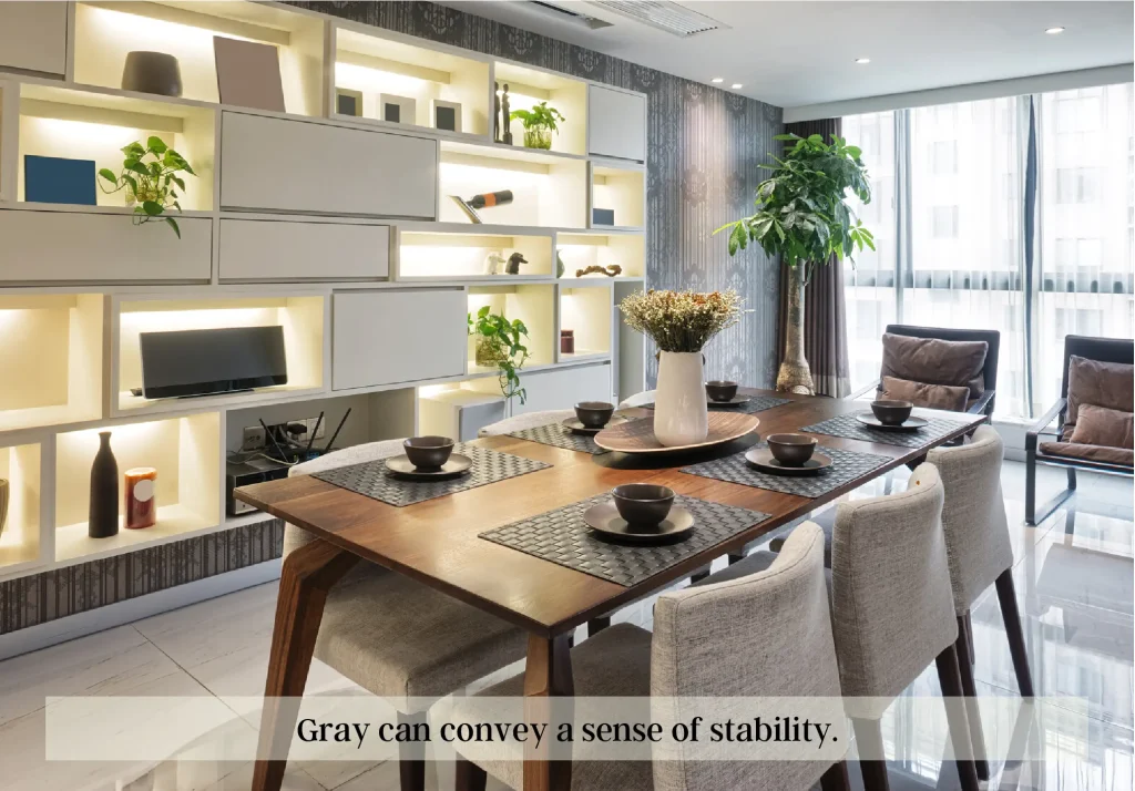
Gray is a neutral color that can often evoke feelings of stability. Interiors designed with shades of gray can create spaces that are devoid of strong emotions while still being modern and fashionable.
People often feel grounded in homes where designers use dark gray, much like the color black.
However, an entire room of gray is often dull and lifeless. To avoid this, utilize a variety of textures, patterns, and finishes to add some dynamism to a gray room. Silver in particular can add some shine, while patterns in black and white will break up large blocks of gray.
Remember, gray is most effective when used in combination with other colors. This tip will help you create inviting interiors that are both stylish and functional.
Conclusion
Color affects how we experience a space. When interior designers use it correctly, color psychology will create balance between how we want to feel and how a room makes us feel.
Now that you know a little more about color psychology in interior design, you can start to think about how you want to use colors in your design projects.
No matter what your style, understanding the psychological effects of color can help you choose the perfect hue for your space. So next time you’re considering painting your living room yellow, remember that it might just make everyone a little happier. And if purple is your favorite color, go ahead and use it in your dining room – just be prepared to entertain in style.
How did you go about selecting colors for an interior before reading this article?


